Provis - Project Builder
Lead UX Designer


Overview
This project is a recreation of a real client engagement. While all branding and content have been replaced to protect client confidentiality, the workflows, processes, and solutions showcased here accurately reflect the original work.
Provis provides high-quality commercial technology solutions designed for efficiency and ease of use in demanding environments. As the lead designer, I developed a responsive user experience to help sales reps seamlessly build projects and generate quotes for their clients.
MY ROLE
UX Lead - Interaction Design, Usability Testing, User Research, Rapid Prototyping.
TEAM
Project Managers
Developers
Sales
DELIVERABLES
High Fidelity Designs
Research
User Interviews
Sales Feedback
Highlights
Custom projects, client-ready, streamlined.
Dashboard
The dashboard provides a warm welcome with key action items and a prominent 'Create New Project' CTA. It highlights recent projects with status updates and an activity feed for a quick overview.


Project builder
The project builder allows users to seamlessly switch between projects using a dropdown and features a prominent 'Add New Project' CTA. A search bar and sticky quote summary ensure users can easily find products and track their quote in real-time, with attachments and documents available for added convenience.

My projects
The My Projects page displays a sortable table of all user projects, allowing filtering by date, status, or quote price. Users can quickly search through projects or start a new one with the 'Create New Project' option.

Problem Statement & Context
A costly system in need of change.
Provis’ sales team relies on auto quotes, an expensive and inefficient process. Attempts to use the existing wish list system have failed due to its limitations, forcing sales back to auto quotes. A robust in-house solution would streamline sales, cut out dealers—who have hurt Provis’ reputation—and give the company more control over the sales process, ultimately saving time and money.
My role.
As Lead Designer, I drove the design process with a results-focused approach, leading a small design team of two. I conducted user research, including testing and discovery interviews, to identify key pain points. Collaborating closely with project managers, sales, developers, and stakeholders, I ensured our solutions were both effective and aligned with business needs.
Goals.
SAVE COSTS
Reduce reliance on auto quotes to save costs
STREAMLINE
Create a streamlined in-house system for sales
REPUTATION
Improve Provis' reputation by cutting out dealers
Current Situation
What are we working with?
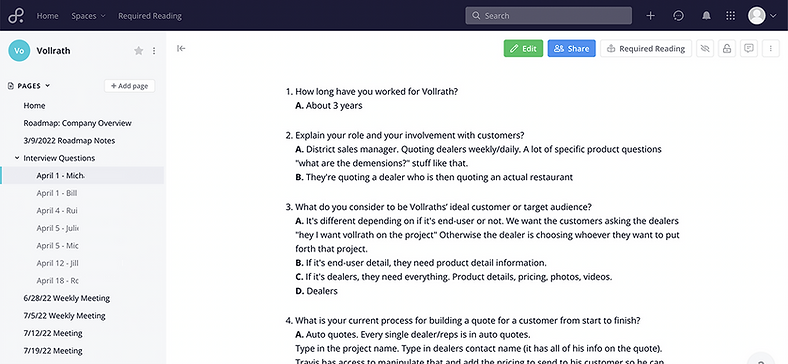
The project began with Provis outlining their current setup, starting with their existing wish list system for analysis. Auto quotes were inaccessible due to paywalls, but this wasn’t a roadblock—I later uncovered their key sales requirements through interviews.

Wish list system
The wish list system has poor usability—users are limited to one list, can only send quotes via email or CSV, and must scroll up to submit due to a non-sticky sidebar. Deleted items can’t be undone, causing frustration. I explored deeper sales requirements through interviews.
Investigation
Speaking with sales—their requirements?
Pain points
Solutions
VISUALS
Quotes are bland and could use more visuals.
IMAGERY
Allow more visuals to be added such as product imagery and videos.
PAST PROJECTS
Users have had trouble finding past projects.
FILTERING
Add a filtering feature allowing the user to sort by date, dealer name, end user name, etc.
AUTO QUOTES
Continue to use Auto Quotes so a new system could cause frustration.
INTEGRATION
Incorporate integration to allow exporting quotes directly to Auto Quotes.
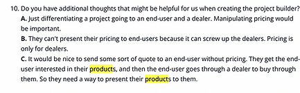
MISSING DOCUMENTS
Want catalogue pages or spec sheets with photos included in the quotes.
ATTACHMENTS
If a product has any supporting documents, add it to the quote so customers have access.
85.7%
of interviewees agreed with a live, updatable link for the quote. This would help with the pain point of large PDF file sizes and manual updates needed for price changes.
12/14
71.4%
of interviewees agreed about suggested products. Suggesting products would increase efficiency for sales reps and upsells would help customers make better purchasing decisions.
10/14
100%
of interviewees agreed about creating filtering options for projects. This would help users quickly and easily sort/find projects based on dealer name, end user name, project type, date, etc.
14/14
Testing
Testing the designs with sales.
After the interviews, I refined the designs with stakeholder input to align with project goals. Each stage, from low to high fidelity, was tested and improved. Once finalized, the high-fidelity wireframes underwent successful user testing.
SUCCESS
Sales reps found the interface intuitive and appreciated the streamlined workflow.
Particularly the dashboard interface and project statuses.
CHALLENGES
Users were unclear about which attachments corresponded to specific products, leading to a redesign for better association clarity.
OPPORTUNITY
Recognized the potential to implement an internal messaging system for managing external communications, along with a more robust notification feature.
Both of which would be V2.
Adjustments
Addressing the challenge.
Challenge
Users struggled to identify the correct attachments that corresponded to specific products for their projects.


Which attachment?
Although recommended attachments were showcased at the bottom of the project, it wasn’t intuitive enough for the user to understand which attachment goes with which product.

Rewind <<<
Rethinking—How do they search for products?
I revisited our findings and focused on questions related to product searches. It became clear that sales reps primarily search for products using ID numbers rather than keywords—despite product IDs not being displayed on their current product cards.
The split was approximately 70% for ID searches and 30% for keyword searches.


Updating—Product ID
Added the product ID number as a secondary title to every product as well as in front of every attachment.
(This is how they search).

Updating—Attachment CTA
Added interactive "attachments" CTA giving the user immediate access to all relative attachments.


Updating—Popover
The popover gives the user quick access to see ALL relevant attachments to the respective product.
Results
Designs were retested with 14 fresh users.
100%
14/14 of the users successfully added the correct attachments to the correct products.
50%
Half of the users utilized the "Attachments" CTA feature on the card that was added.
It was reported that this was very time consuming because they could now add attachments at the end of a quote.
50%
Half of the users utilized the bottom attachment section. Stated that adding the correct ID number was very natural to their instinctive workflow.

Key Metrics
Key metrics and projected findings.
Following the implementation of the new system, we observed significant improvements in adoption, cost savings, and overall sales team efficiency. Below are key metrics that demonstrate the impact of the transition from the auto quote system to the new solution, highlighting both quantitative and qualitative gains.